Swedish krona
SEK - kr
Norwegian krone
NOK - kr
Euro
EUR - €
Danish krone
DKK - kr
Swiss franc
CHF

From a start-up to a leading camper sharing platform in 5 markets. After teaming up with the former company “Housecar” and entering into the Nordics, it was the right time for a change of our look. Now we’re happy to introduce you to our new visual world which is folksy, warm and energetic. This runs through all of our components, from our unique color palette to our friendly and geometric typeface. But let me take you through it.
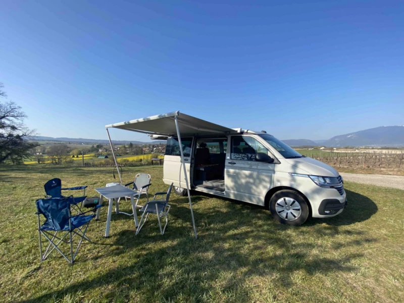
MyCamper was founded back in 2015 with the simple vision to make camping accessible for everyone and to make better use of existing resources of camping vehicles.
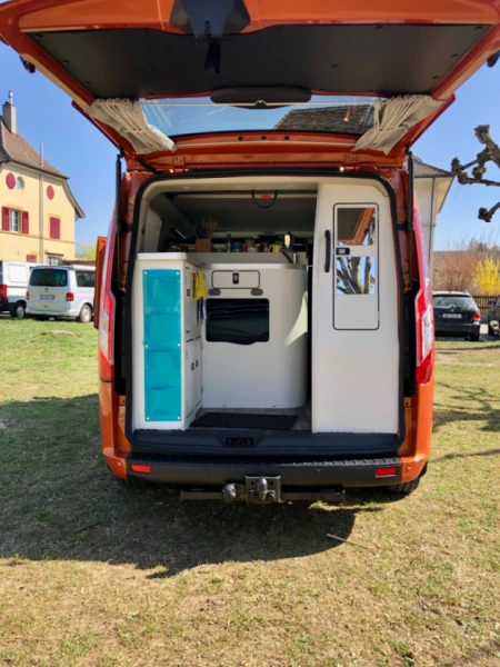
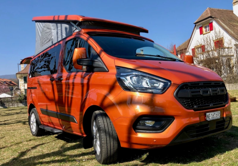
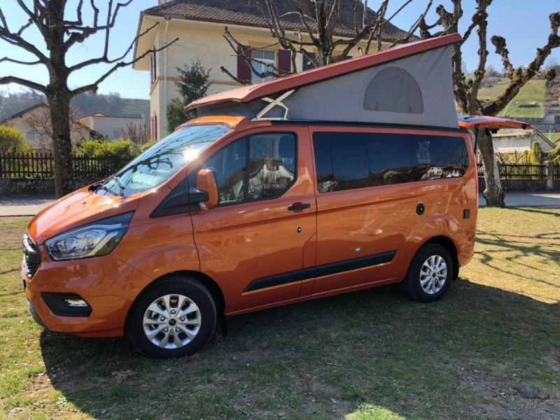
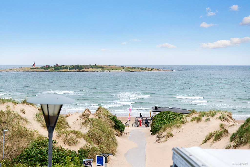
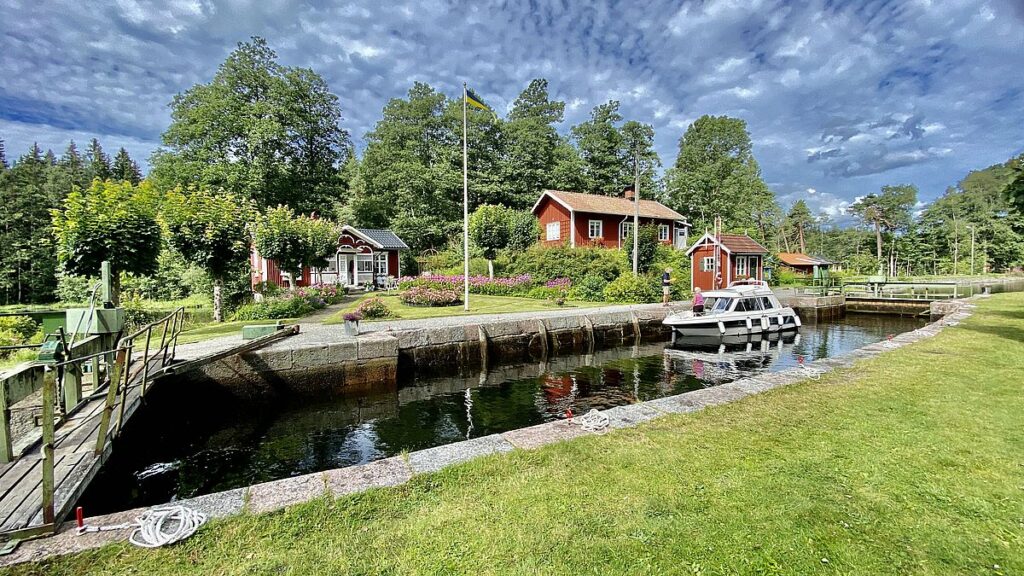
From a 3 people start-up, we’ve grown to a 25 people company and leading camper sharing platform in Switzerland, Sweden, Norway, Finland and Denmark. Since then, we’ve had 45’226 bookings over our platform where 123’000 people went on a camping trip. On the other hand, we grew a big camping community of 5000 vehicle owners who not only share their motorhomes, campervans and caravans on MyCamper but also the passion about camping with others.
After the expansion to the Nordics, we wanted to create a brand, where all our character come to life and can be identified throughout all the markets we’re active in.
MyCamper is recognised as a friendly and reliable digital service. Through these years and in the rebranding process we realised, that we are even more than that. We figured that we also love to explore and be outside but also thrive to be better constantly. So, how can we reflect our brand identity in the visual world? This was quite a challenge but we found a visual language which reflects our folksy, warm and energetic brand.
We really liked our old logo (rest in peace) but the mountains and the retro camper didn’t really reflect the broad camping world. We wanted to create something new which feels more inclusive to all people who seek new adventures, is friendly and reflects our reliable digital service. We have found the answer in creating a minimalistic and abstract logo design in which exploring adventure is in its own way.
MyCamper’s new logotype consists of a clean wordmark which is re-drawn from our new font Poppins and comes with two versions, filled and outlined. The primary logotype is the outlined version.
Basis of MyCamper’s logo is the new distinctive “window graphic” as we call it. When you have a closer look, you clearly see the shape of a vehicle window. It represents exploration, and finding new experiences through the lens of a car window. What do you see when you look through the window? This is a personal question and one sees different meanings in it. For MyCamper it means to explore and travel the outdoors and the winding landscapes of nature.
You can also see an abstract symbolism in the logo icon – the wave has the shape of an “M” and the line in the top right corner has the shape of a “C”. Which is MC for MyCamper.
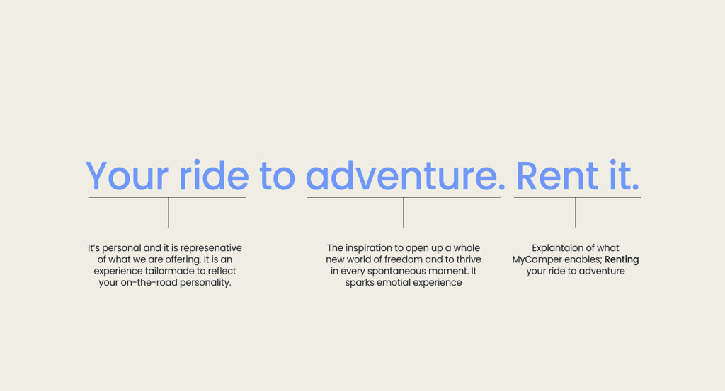
Within this rebranding process, we really started from scratch and had to also re-think of who we are as a company and redefined our brand identity. We wanted to break free from our old tagline “from campers – for campers.” because we felt that we were much more than this represents. So we came up with this new tagline: Your ride to adventure. Rent it.
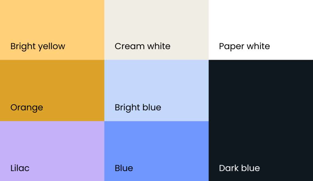
Our new color palette is warm, friendly and stands out on its own. It creates a great contrast to the outdoorsy world and nature. As we are recognised as a blue brand, we wanted to keep this color. The colors “Bright blue” and “Blue” are 2 of the primary colors. “Bright yellow” is the third primary color in our palette which brings in a warm touch to it, “Dark blue” we use mostly as the primary font color.
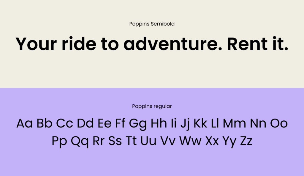
Our new font Poppins beautifully combines the elegance of a sans serif with the personality and warmth of our service. This friendly font also brings calm to the new colourful world of MyCamper and thus rounds off the new brand identity.

Your ride to adventure. Rent it.